
Written by webtechs

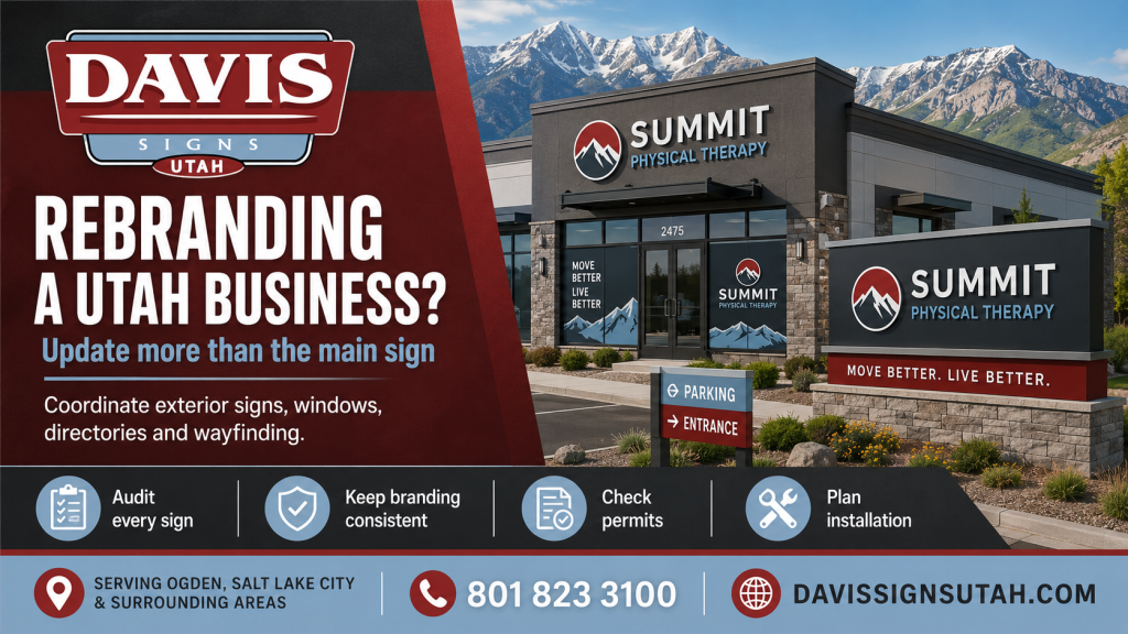
Rebranding a Utah Business? Update More Than the Main Sign
Rebranding a Utah Business? Update More Than the Main Sign

A new logo may begin on a computer screen, but a business rebrand eventually reaches the building, parking lot and front door. The exterior sign is only the most obvious piece. Customers may also see an old logo on a monument sign, window graphic, lobby wall, directory panel or directional sign. When those pieces disagree, the business can look halfway through a move rather than confidently established.

For Utah companies, a sign update works best when it is planned as one coordinated project. That protects brand recognition, reduces repeated installation work and gives customers a clear visual path from the street to the counter.

Begin With a Complete Sign Inventory

Walk the property as though you have never visited it before. Start at the nearest main road and record every place where the company name, logo, colors or directions appear. Include pylon and monument panels, building letters, door hours, window vinyl, parking signs, reception signs, directories and room identification.

Photographs are useful because small inconsistencies are easy to miss during a quick inspection. One tenant panel may use an old typeface. A delivery entrance may still show the former company name. A faded window decal may be more noticeable than anyone inside the business realizes.

The inventory should also note each sign’s size, condition, lighting and mounting method. Some parts may only need new graphics. Others may be worn enough that replacement makes better financial sense. Davis Signs Utah already offers these different exterior, interior and directory sign formats, making the site suitable for a coordinated sign program.

Keep Recognition While Improving Readability

A rebrand does not require forcing the exact digital logo onto every physical surface. Fine lines, small wording and subtle color differences may work online but disappear on a building or roadside sign.

Sign Research Foundation guidance identifies letter size, contrast, placement and viewing distance as major factors in sign legibility. The practical goal is to preserve the recognizable character of the brand while adapting it to the location. A simplified logo, stronger contrast or wider letter spacing may make the sign easier to understand without making the business look unfamiliar.

Test major exterior designs from the road and after dark. A sign that looks balanced from the pavement may be too detailed for a driver approaching the property.

Check Property Rules Before Approving Artwork

A landlord or property manager may control sign colors, letter height, lighting, raceways and approved mounting areas. City requirements may also affect sign size, location, structure and illumination.

Salt Lake City provides a specific sign permit form for exterior signage and requires construction documents with the application. Ogden also lists installing signs among work requiring a permit. Those requirements are a good reason to settle the property rules before fabrication begins, not after the final artwork has been approved.

Ask who will handle the permit, electrical information, landlord approval and installation access. A good schedule leaves room for review rather than relying on a temporary banner during an opening or relaunch.

Plan Removal and Installation Together

Taking down an old sign may expose holes, wiring, faded wall areas or outlines left by the former letters. Those details should be included in the survey. The new sign may cover them, but sometimes the wall needs patching, paint or electrical work first.

Sequence matters when several signs are changing. Exterior identification should usually be ready when the public announcement begins. Door graphics, lobby signs and directories should follow the same naming and color standards. Vehicle graphics and printed materials can then reinforce the same identity instead of introducing another variation.

Build One Sign Family

A successful rebrand feels consistent without making every sign identical. The building sign can be bold, while a directory or regulatory sign remains restrained and easy to use. Repeating the same colors, type styles and logo treatment creates a connection across the property.

Coordinate Your Utah Business Rebrand

Davis Signs Utah designs, fabricates and installs custom exterior and interior signs, corporate branding systems, window graphics, directories and complete commercial sign packages. For help coordinating a Utah business rebrand from Ogden to Salt Lake City and surrounding areas, call 801 823 3100 for a free commercial sign estimate.

Live References

Davis Signs Utah

Davis Signs Utah Commercial Sign Packages

Davis Signs Utah Indoor Signs

Sign Research Foundation: Sign Legibility and Visibility
Salt Lake City Sign Permit Forms

Ogden City Permit Requirements

ADA Sign Requirements for Utah Businesses
Written by webtechs

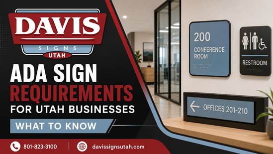
ADA Sign Requirements for Utah Businesses

Accessibility signs do more than satisfy a technical requirement. They help visitors identify restrooms, offices, exits, accessible entrances and other permanent spaces without needing to ask for assistance. For Utah property owners, the challenge is knowing which signs need tactile lettering and braille, which only need clear visual information, and where each sign should be installed.

The final sign plan should be reviewed against the standards that apply to the particular building. Still, several basic rules help owners avoid common ordering and installation mistakes.

Permanent Room Signs Need Special Features

Signs that identify permanent rooms and spaces generally need both visual and tactile information. Examples include room numbers, restrooms, conference rooms, mechanical rooms, locker rooms and stairways.

These signs commonly use raised characters with braille positioned below the text. The surface should limit glare, and the characters need sufficient contrast from the background. Decorative lettering that is overly condensed, italic or difficult to distinguish may not meet the applicable requirements.

A temporary paper label or attractive printed plaque is not automatically an acceptable permanent room sign.

Directional Signs Follow Different Rules

Not every interior sign needs raised text and braille. Signs that direct visitors to a location or provide information generally must meet visual requirements but are not usually required to be tactile.

Examples include arrows pointing toward elevators, instructions at a reception area, office directories and signs explaining building rules. The lettering still needs to be readable, properly sized for the viewing distance and set against a contrasting background.

This distinction matters because ordering every sign in the same format can add unnecessary cost while still failing to create a useful wayfinding system.

Placement Is Part of Compliance

A correctly manufactured sign can still create a problem when it is mounted in the wrong place. Tactile room identification signs are normally placed beside the door so a visitor can locate and read them without standing in the path of the door swing.

The federal guidance sets a mounting range based on the height of the tactile characters. Door configuration, wall space and approach direction can affect the exact location.

Installation should therefore be planned before signs are fabricated. Waiting until the end of construction may reveal that switches, trim, artwork or other fixtures occupy the required wall area.

Restroom Pictograms Need Supporting Text

A familiar restroom symbol helps many visitors recognize the space quickly. When a pictogram identifies a permanent room, however, the symbol does not replace the required tactile wording.

The pictogram field and the text beneath it must be designed as a complete sign. Braille, raised characters, contrast and spacing all need to work together. The same planning applies to signs identifying accessible entrances, assistive listening systems and other accessible features where symbols are required.

Branding Can Still Be Part of the Design

ADA signage does not have to look generic. Businesses can often coordinate compliant signs with their interior colors, materials and overall visual identity.

The important point is to preserve readability and required tactile features. A company may use acrylic, metal accents, layered materials or custom shapes while keeping the text, finish, contrast and installation compliant.

Planning the full interior sign package together also helps room signs, directories, directional signs and lobby graphics look intentional rather than assembled from unrelated products.

Review Signs When a Building Changes

Renovations, tenant changes and office reconfigurations can leave signs inaccurate or incomplete. A room may receive a new use, an accessible route may change, or an old sign may be moved without checking its mounting height.

Walk through the property from the perspective of a first time visitor. Confirm that permanent rooms are identified, directions remain clear and required accessibility symbols are present. Local building officials may also apply current Utah adopted construction codes during permitted work, so requirements should be confirmed for the project location.

Order ADA and Regulatory Signs From Davis Signs Utah

Davis Signs Utah designs, fabricates and installs identification, regulatory, directory and directional signs for businesses from Ogden to Salt Lake City and surrounding communities. The company can coordinate accessible signage with your brand and broader commercial sign package. Call 801-823-3100 to discuss your property and request a free commercial sign estimate.

References

Davis Signs Utah: Identification and Regulatory Signs

Davis Signs Utah: Directional and Directory Signs

Davis Signs Utah: Contact Information

United States Access Board: Guide to ADA Sign Requirements

Salt Lake City: Current Building Codes